Shipped
Redesigning the talabat app for the new brand
talabat had a new brand, and the app still looked like the old one. I led the creative direction and the design strategy for the app's first redesign, working with a team of designers and every product team. Together we won the CEO's buy-in, and that work set the style the app uses today.
- Role
- Creative direction and design strategy for the app redesign
- Team
- I led a team of designers working toward one goal, with user research alongside
- Timeline
- Started about a year before the new brand launched
- Platforms
- iOS and Android app
- Tools
- Figma
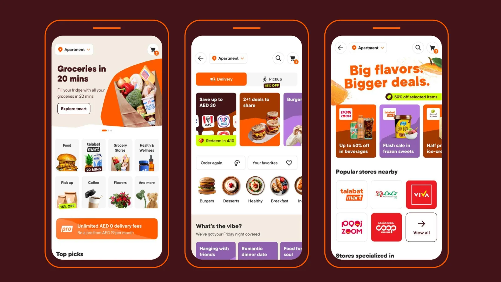
The starting point
The brand team had launched a new identity for talabat: louder colour, bold type, real food photography and a hand-drawn imperfect line. The app still wore the old look.
My job was to bring the new brand into the app without changing how people order. The flows stayed as they were. The visual layer, the motion and the design system changed.
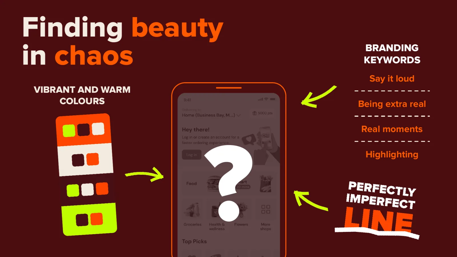
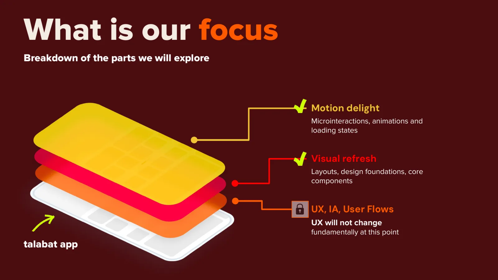
A year of lining everyone up
We started about a year before the new brand went live. Most of that time went into agreeing the look and feel with every team, so that by launch the app was ready for the brand.
Design
Teams and leadership
Design system
How we got everyone on board
A redesign for a new brand touches every team, and each one has its own targets. We treated buy-in as part of the design work and planned it from the start.
Bring every team in early
We ran working sessions with each product team. Their goals went into the new look before any screen was final, so nobody saw the redesign for the first time at the end.
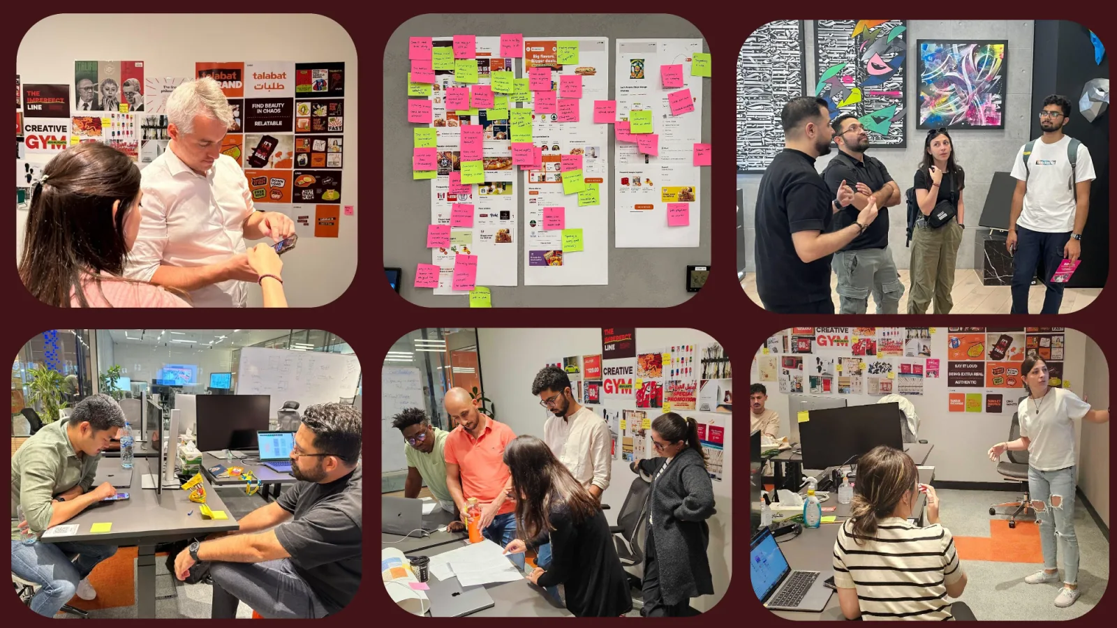
Working sessions with the product teams. Give leaders a real choice
We designed two directions. The safe one could ship on the existing design system. The bold one pushed the brand further and cost more to build. Showing both made the trade-off clear.
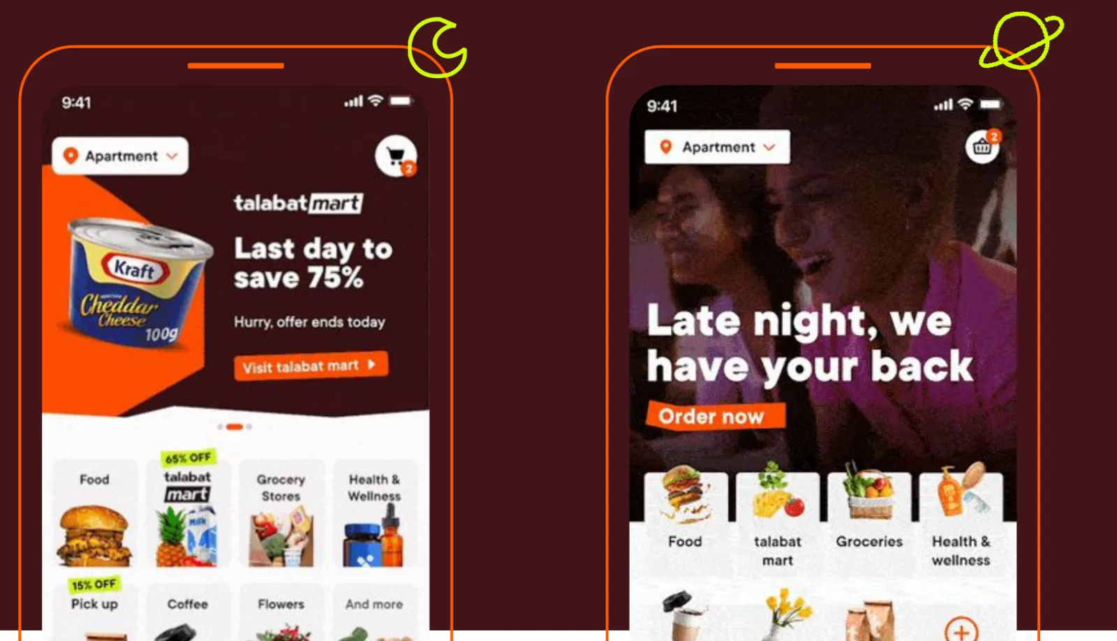
The two directions: safe on the left, bold on the right. Let users settle it
We tested both directions with users. The safe one felt clean and trustworthy. The bold one felt fresh but busy. We kept the best of each and merged them into one concept.
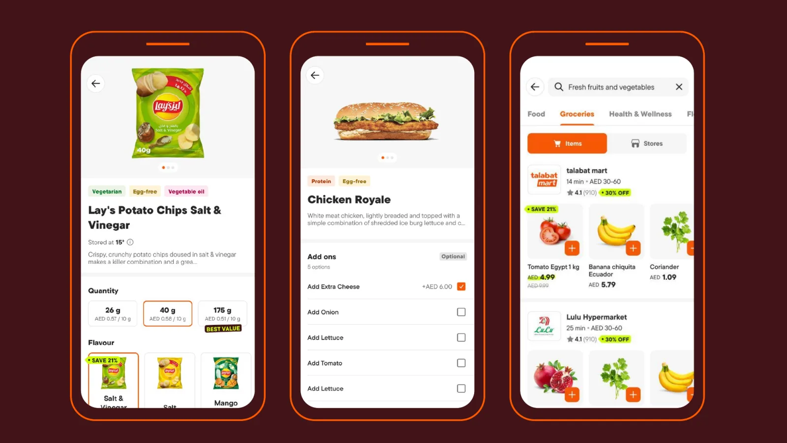
The merged concept, built as a working prototype. Present it to the CEO
We presented the concept to the CEO with the prototype in his hands. He loved the loading screen and the new promo tags. He asked for orange to lead and for tighter cards, because every pixel on the screen is worth money. Those notes went straight into the next version, and we had his sign-off to continue.
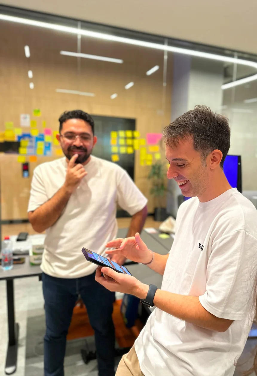
Trying the prototype with the CEO. His first words: “This app is exceptional, literally.”
What changed in the app
The flows stayed the same. Everything people see and feel changed.
New type in English and Arabic, bold for the messages that matter. Orange only for actions, and lime only for promotions. One rule for corner radius. A new icon family. Real food photography, never retouched to look fake. Motion in the loading and order-tracking moments.
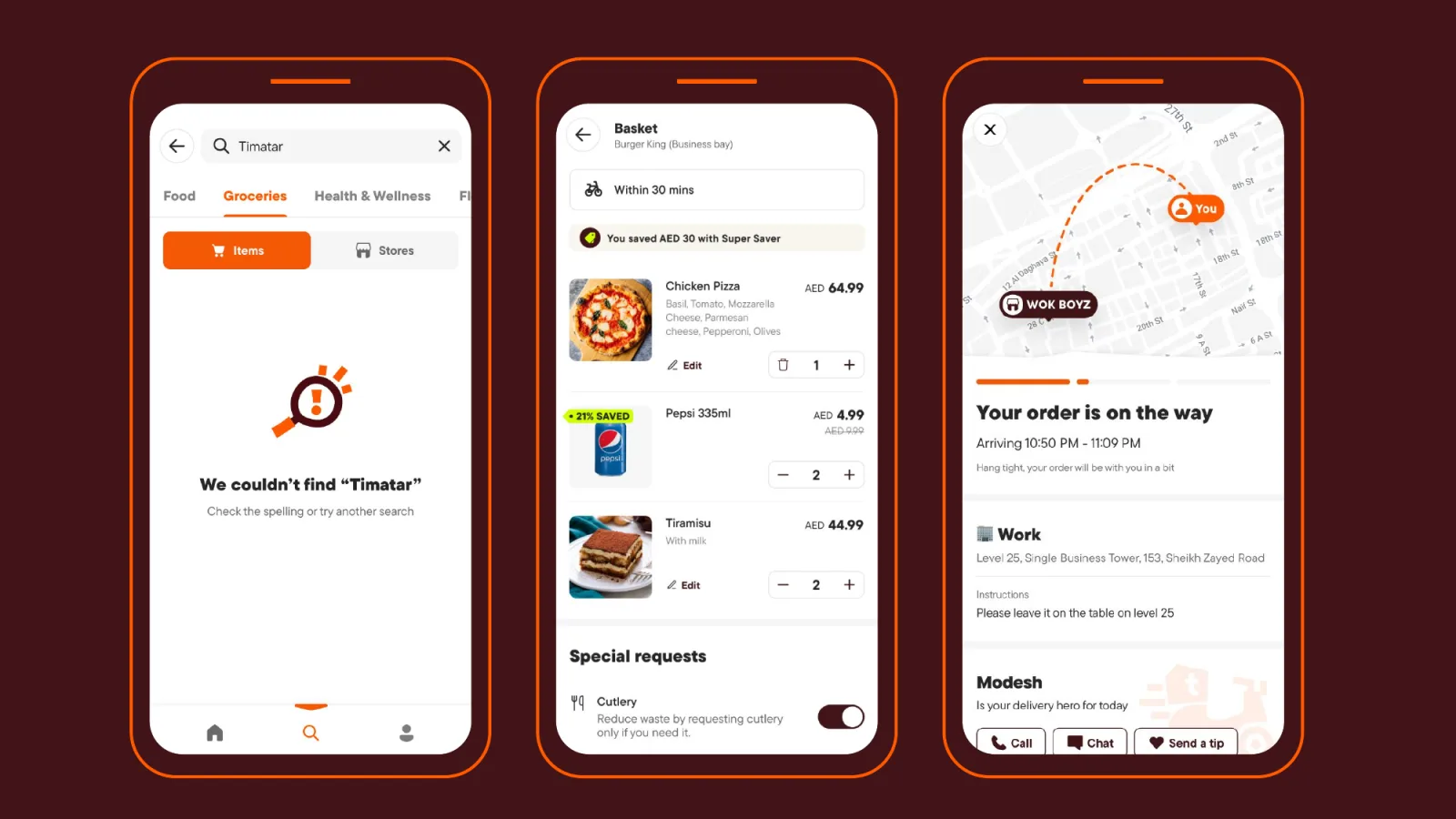
Illustration and motion
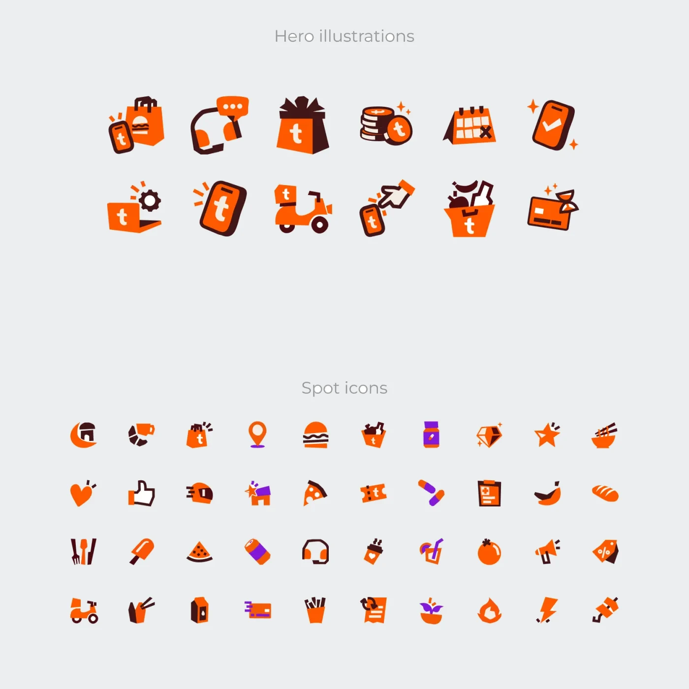
The redesign set the base for the rest of the rebrand. On top of it we redrew talabat's illustrations and icons in the new style, and brought motion into the moments that matter: loading, order tracking and confirmations.
Where it landed
The concept became the new version of talabat's design system. Teams adopted its colours, type, spacing and icons across the app first, then its components.
When the new brand launched, the app was ready for it. The style we set in this first redesign is the one the talabat app still uses today.
Designed at talabat with a team of designers, user research and programme management. The brand identity came from talabat's brand team; this work brought it into the app. Screens are from the concept and its prototype.
More from talabattalabat rebrand and motionWant to talk about this project? Email is quickest.